Journal

The Struggle with Technology

Innovation is all around us. New products and flashing new programs grace the headlines, from the newest Apple products, to medical and science technology soaring to new heights.

In the creative fields, we often hear about new products and programs, each boasting new ease and promising incomparable results with a tap of the finger or swipe of the screen.  These can dazzle, and those of us who do enjoy testing a sleek new device or program can find ourselves drooling at the prospect of something to make our endeavors that much easier, and well, it looks so cool!

Much like those of us captured by the Apple cycle, it can be tempting to seek the newest programs and products with the promise we subconsciously tell ourselves that newer must be better.  The trouble is, what if it’s not?

When introduced to a new program, or surrounded by new programs, we need to block out the din of advertising and think critically of its worth.  Is this a reliable brand and useful product, or just a fleeting new toy? Will I be able to adapt to the new program with ease? There’s not much use in acquiring a new program if the cost and time of learning it outweighs the benefit. Of course, with the internet, you can look up reviews, and tutorials for that matter, and a good many of them may relate directly to your creative field of choice that can give you an idea of whether it is worth diving in.  However, while reviews can be helpful, they should not take the place of self-assessment, in cost and hours that will need to be spent; and most importantly, what’s the point?

In our office, we’ve begun a communications project, in which we are creating short animations. The goal is to give new life to the documentation of our projects and to enhance our digital media presence.  Before getting to that though, we had to establish the narrative, and figure out purpose. Why are we doing this?  What do we want the audience to take away, who is the audience?  After some discussion we agreed that a diagrammatic animation would best illustrate the design strategies and qualities of this particular project to those who love as well as those who practice architecture.

Screenshot of our project in progress.  Click the image to view our animation!

Screenshot of our project in progress.  Click the image to view our animation!

In this particular case, I was able to choose a program I am comfortable with, but it had me thinking about the nature of programs and their use within the creative fields, and naturally, architecture. Since I was animating, I couldn’t help but think of how animation has found a niche in architecture, most commonly found in the form of sleek and sexy renderings to promote a design in order to win a project.  I speculated on this, sometimes drawing parallels to movie trailers, showcasing a building’s design, a flock of birds startled at its beauty, taking flight as the most perfect lens flare glints off the edge of the structure.  How picturesque; how epic!

There are numerous articles and debates that can easily be found via Google vouching for or railing against the use of computer generated renderings.  The arguments go back and forth about whether these building trailers are helping or hurting, creating unrealistic expectancy in the final product.  Examples abound of renderings boasting one thing, the final project squeaking something else.

By comparison, our project is about the design process of a completed building, animated for better understanding, rather than a glamorization of a promise.

While we have no expectations that the use of technology to create ultra-real renderings will diminish, we do hope that animation will sponsor more explorations of process alongside product.

After all, there are good chances that some of these slick renderings and our process animations were created, at least in part, using the same program.

Don’t get me wrong, I love checking out a fancy rendering and they are certainly attractive, but I hope to see more animation in the field, its use varied, and like the new programs popping up, innovated.  Animation is the tool of choice for what we are looking to accomplish in this particular project; it’s important to remember that it has endless possibilities.  Those possibilities must be assessed on our personal creative needs, before it can come to fruition, or we risk wasting time, money, and effort.

So, before you jump on board to the newest program or device, remember: all technology is a tool, nothing more, nothing less, and it’s how you use it that matters. ​ 

Spaces from Childhood

As designers of spaces for young children, we can’t help but reference our own childhood experiences, either consciously or subconsciously. The following are favorite spaces we inhabited in our youth, and our musings on why they were so memorable.  We agree that spaces which imprint the best childhood memories, whether intentionally or accidentally created, emerge from the fertile ground at the intersection of freedom and security. Our mission as grown up professionals is to approach design problems with creative innocence, as  a child would, without preconceptions, yet tempered by informed intuition.

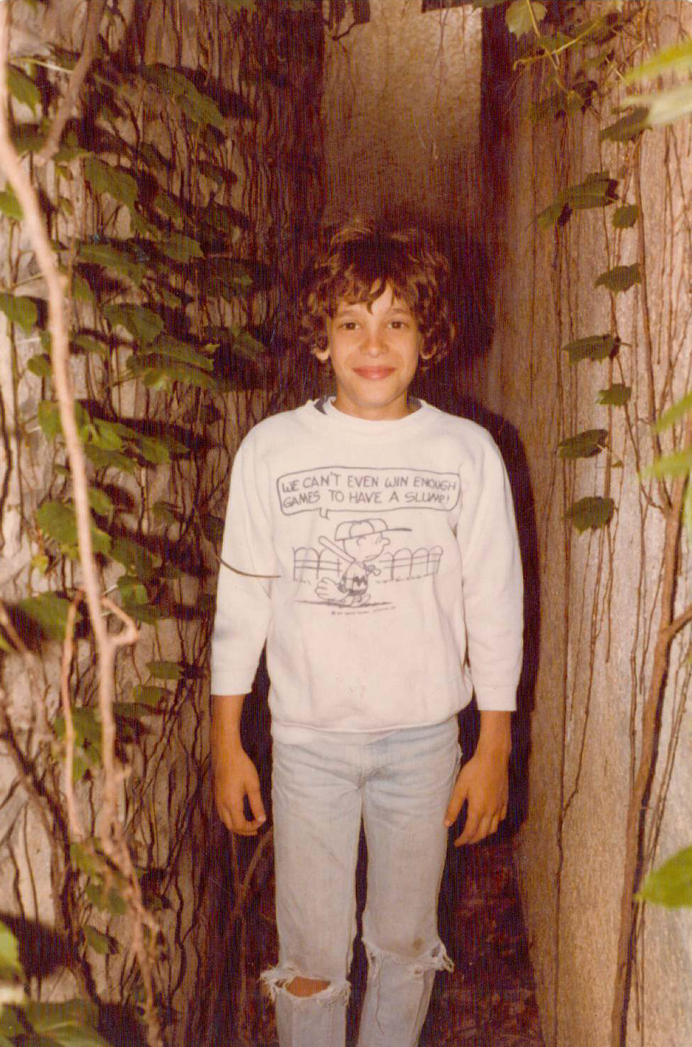
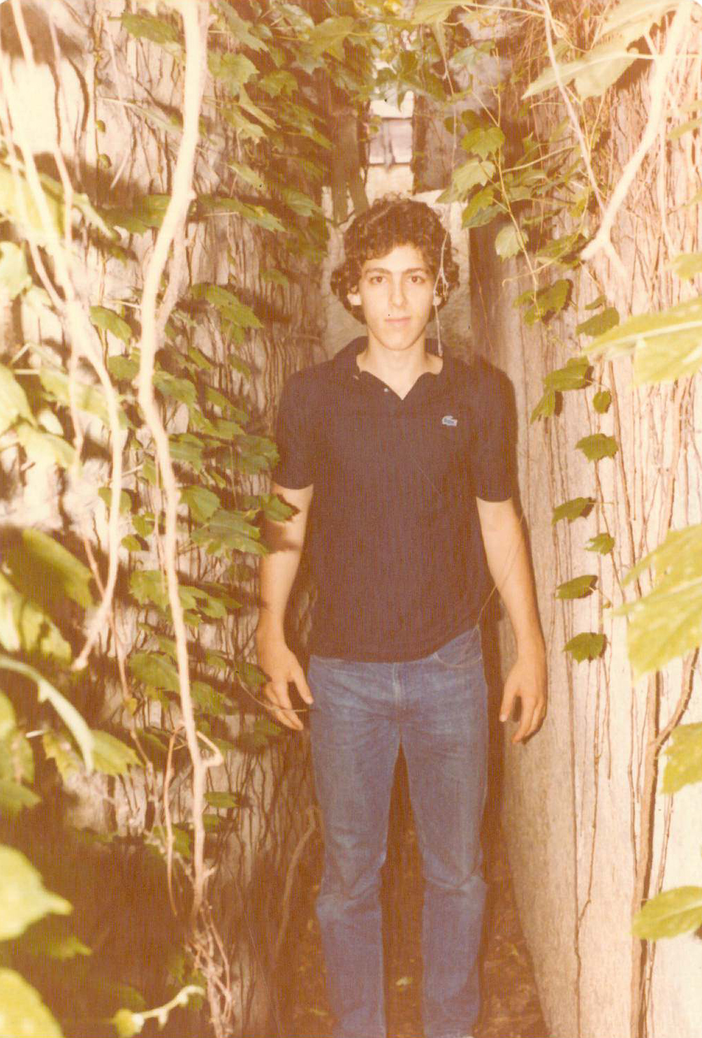
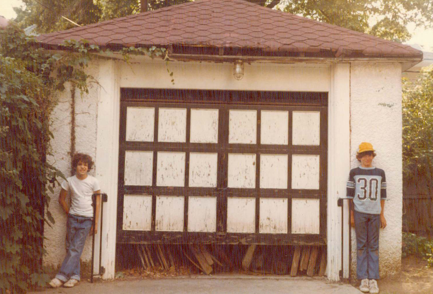
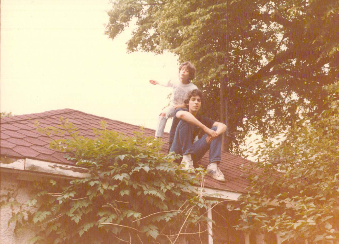
The garage at the home where Loretta grew up in Brooklyn abutted their neighbor’s garage, creating a narrow sliver of space bound by two walls, only about 18 inches wide at the ground, narrower up at the eaves, and about 20 feet long and 10 feet high.  On the ground was a couple of feet of dead leaves;  the walls were covered with ivy vines, and the space was of course open to the sky.  Its most alluring feature was its secrecy – no nosy adult was likely to ever stumble upon her and her siblings, since the slot of space itself was shielded from view by some hedges. As she and her brothers grew older, they were able to scale the walls to scrabble up to the garage roof, a perch from which to observe the neighborhood activity. What made the space memorable for Loretta was its seclusion and uniquely child sized dimensions, a secret sliver of space no one else knew ever existed.
           Loretta Arthur, Principal

Adam’s favorite space as a child was a steep hill in the back garden of his suburban London family home. It had the perfect slope for cruising down at great speed on the back of a Tonka truck. It’s landscaping wasn’t precious– Adam was able to dig a deep hole from which to hide in and peek out. Many hours were spent in the pit imagining it as a foxhole and dashing down the slope after bad guys. Adam’s back garden hill allowed for exciting, challenging physical activity, creativity in forming personal space and a platform for make-believe play.
           Adam Collier, Project Manager

In Arizona,  late summer means monsoon season and the daily cacophony that comes with. Renee’s favorite play space as a child was hiding by herself or with her cousins in her grandmother’s linen closet when the storms would begin. The closet doors had wood jalousie panels allowing for observation but could be shut when the lightning started. Sheets and towels made for quick forts and comfy seats. This space is also an enclosed, secure place that could easily be modified as desired.
          Renee Roediger, Project Manager

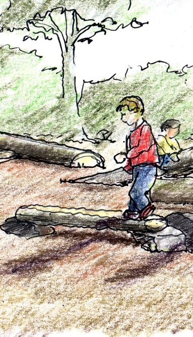
logs_and_stones-color.JPG

Space for Words

Story time in children's library at Beacon Hill Nursery School 

Story time in children's library at Beacon Hill Nursery School 

"Do you like green eggs and ham?" Sean Gray, an architect at D.W. Arthur Associates, would begin the classic Dr. Suess book to his restless 2 and 4 year olds. As this was likely the 4 millionth time of his reading this particular story and the kids didn't seem to be paying attention, Sean would stealthily skip a few rhyming pages. They could sense the change in the story, or perhaps Sean's slight smile gave him away, and they would shout, "wait wait WAIT! you missed the part about the goat!" The reading of the longest book comprised of just 50 unique words would continue on to its grueling end.

Luckily, the monotony didn't deter Sean from his habit of reading to his children. Based on early education research, the volume of words heard between age 0 to 3 is one of the most important factors in early language development. From a landmark study by a pair of psychologists, a staggering correlation was found between the number of words spoken to the child and the child's verbal ability and success in school.  Up until the age of three, most children's primary conversation partners are adults. The varied language spoken by these adults, likely parents or care takers, help to develop language skills.

The article "Talk to Me, Baby!: Supporting Language Development in the First 3 Years" by Betty Bardige, Ed.D., a developmental psychologist and educator, explores the findings of the landmark study and other subsequent studies. According to Dr. Bardige, "rich language input and responsive, playful relationships during the preverbal and one-word stages build a reservoir of linguistic and conceptual knowledge that fuels the toddler's language explosion." Those who use words well have ongoing advantages. In preschool, they are sought after by their peers for their ability to have play conversations. They are also better able to explain their feelings or their problems, allowing them to talk through conflict. Dr. Bardige also notes that children who enter kindergarten possessing a better understanding of word meanings and sentence construction are better prepared for reading. 

rich language input and responsive, playful relationships during the preverbal and one-word stages build a reservoir of linguistic and conceptual knowledge that fuels the toddler’s language explosion.
— Betty Bardige, Ed.D.

Designing Spaces for Words:

Typically underutilized, spaces like this one in a stair well was designed to include a destination reading nook for the MIT Child Care Center. 

Typically underutilized, spaces like this one in a stair well was designed to include a destination reading nook for the MIT Child Care Center. 

Destination Libraries

One of the simplest ways to create space for verbal development is to include a library within a children's center. Dr. Bardige writes that "book sharing is one of the best ways to enrich talk" with infants, toddlers and young children. Creating a shared children's library gives emphasis to the activity of reading. If space is limited, children's libraries need not be their own distinct room - they can be located in alcoves off of circulation paths or share space with other destination programming, such as gross-motor or art rooms. 

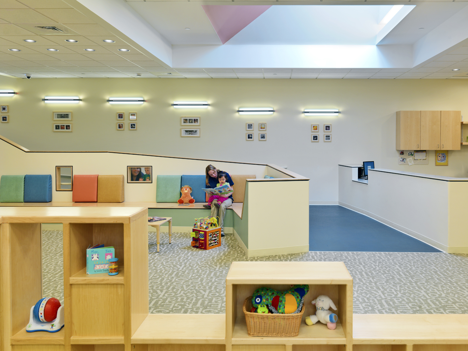
The entrance lobby transition space provided ample area for parents and children to read together at the U. Mass Child Care Center

The entrance lobby transition space provided ample area for parents and children to read together at the U. Mass Child Care Center

Parent/Child Transition Space

Parents are children's main source of communication, so creating a space for parent/child dialogue is important. Reach Out and Read, a nonprofit program based on language and cognitive skills research, creates "literary rich environments" within doctors' offices to encourage families to read together. Child care centers can easily incorporate similar strategies; a parent/child library can be integrated into the drop off or transition space and resource material on the importance of reading together can be offered there. Comfortable seating and a bookshelf could foster new transition rituals with cognitive benefits. 

This large, multipurpose communal space hosts varied conversations among teachers and students at The Children's Center at Harvard Business School 

This large, multipurpose communal space hosts varied conversations among teachers and students at The Children's Center at Harvard Business School 

Communal Space

Spaces that encourage exposure to variations of speech is beneficial to development. Dr. Bardige suggests talking a lot around children; babies need to hear real language (not just baby talk) and toddlers can learn from adults using more advanced words in "context that make their meaning clear." Communal space where multiple classrooms can gather and the teachers are both addressing the children and each other can add to the enrichment of language. The communal space can also host events or lectures from outside of the center, especially if the center is part of a larger institutional or commercial campus. A well-designed gathering space encourages verbal engagement by supporting a range of different types of communication, exposing the nascent students to large volumes and variations of language. 

Perhaps Dr. Suess says it best, 
“The more that you read, the more things you will know. The more that you learn, the more places you'll go.” 


Travel Sketchbooks - Adirondacks

Our own Kelly Ryan spends two weeks each year with her husband and two kids camping in the Pharaoh Lake Wilderness Area of the Adirondacks. I can't tell you the exact camp ground location, as its a well kept family secret. As far as I can tell from her stories, her family spends the time cooking elaborate meals, drinking fancy wine and not answering her emails. Recently I asked her if she ever sketched. Not only did she sketch, she brought art supplies for pastels and watercolors. I assume she brings all of these accouterments to the camp site via donkeys but have yet to confirm. The following are some of her visual musings from her recent camping trip.  

KRyan_Adirondack 2.jpg
KRyan_Adirondack 3.jpg