Journal

Romans invade Wanaka!!! Figure/Ground: Courtyard house in landscape

"keep your eyes on the road!" is often heard in the car when i'm at the wheel, and somewhat more so when driving on left side of the road in a manual shift diesel rental on the narrow New Zealand roads.  I tend to rubberneck to see not only the landscape but also any eye-catching buildings.   So it was when we motored around Wanaka, a growing community in a stunning landscape in the Southern Alps at the shore of the lake of the same name.  There are quite a few unique "bachs" (rhymes with 'hatches') hatching along the lake; some clearly designed by inspired architects.  

"Roman Atrium" house with corner entrance

"Roman Atrium" house with corner entrance

Axonometric of atrium house with in-sloping roofs at courtyards

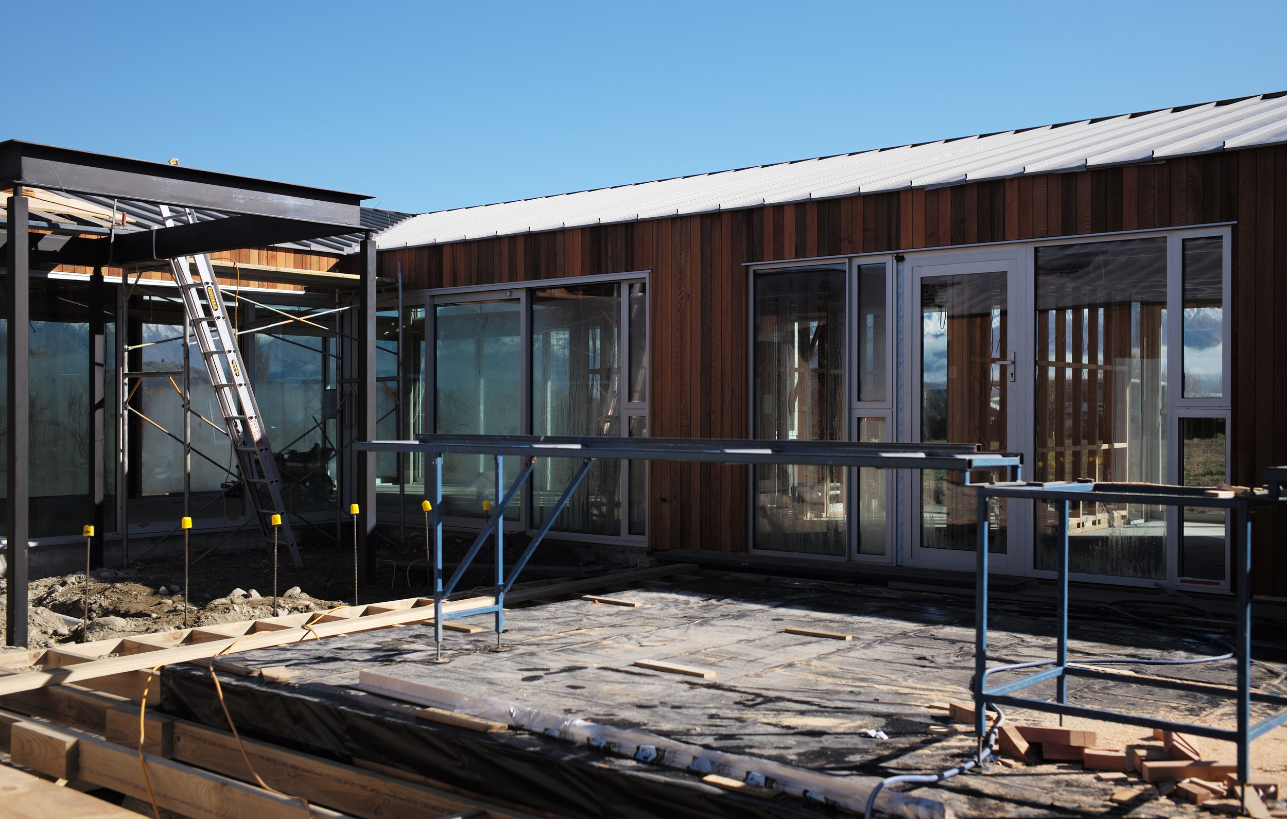
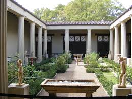
I pulled the truck over to check out one under construction, a clearly articulated rectangular volume with an inverted hip roof sloping inward to a central courtyard from high perimeter walls.  The scheme immediately recalled Roman atrium houses, organized around a central court with an impluvium, though made of red wood cladding and metal roofing, rather than stucco and red quarry tile.  One corner of this tight rectangle is left open, revealing the inner courtyard and entrance, and providing garage access at the flat ends of each wing.  While most bachs are compact volumes organized with interior spaces focused on views to the spectacular surrounding landscape, this building adopts the inwardly focused model of spaces organized around a central courtyard.  Like a Roman house, the exterior walls are tall and mostly opaque, allowing for abutting houses to share a party wall, while maintaining privacy.  Daylight in Roman houses was mostly admitted via openings in exterior walls to the inner courtyard, or atrium.  


"You're trespassing again!" came calling after me as i walked up to have a closer look (another habit that sometimes annoys my fellow travelers).  Yes, i thought, but it's under construction and noone is here, and i can plead innocent architectural curiosity, no?  Instead of simple impluvium and planting urns sporting young carved nymphs, the courtyard was in process of becoming a more complex environment with concrete walls and steel frames - I'll want to return to find out what they become.  But more striking was the transparency, not into the interior rooms, but through them to the landscape beyond.  

Transparency from courtyard through spaces to landscape beyond.

Transparency from courtyard through spaces to landscape beyond.

Roman house courtyard with peristyle colonnade and in-sloping roof.

Roman house courtyard with peristyle colonnade and in-sloping roof.

So, unlike the rooms in the Roman house which open only onto the atrium or courtyard, this home wants to have it all.  the intimacy and privacy of an enclosed court and the extensive sweeping views of a modern villa.  The tension between these two powerful types becomes evident when i toured around the sides of the building away from the street and towards the landscape beyond.  here the taut vertical siding starts to erode and reveal transparent glass.  The erosion and inversion of wood to glass is nearly complete as the wall reaches the furthest corner.


Wanaka Bach with opaque "party wall" progressively eroded towards outer corner and views.

Wanaka Bach with opaque "party wall" progressively eroded towards outer corner and views.

Does it work?  One of the powerful aspects of the Roman house is the clear distinction between public and private and it's reinforcement in the architecture.  In a dense urban fabric, an atrium house might have one relatively mute facade facing the public street, with a public entrance.  Passing through a compact entrance, and relatively dark flanking spaces, one is focussed on the atrium, open to the sky.  The simplicity of bright sky and relative quiet must be in high contast to the noisy, chaotic public street, rendering a level of calm associated with a private house.  For those admitted deeper, the central courtyard with surrounding peristyle was probably even quieter and more serene.  with a interior rooms ranged around the court. the gradation of interior to exterior, dark to light, and private to public would take on a more subtle but still powerful presence.

I wonder whether these characteristics, fundamental to the architectural language of the atrium type, are so diluted in the Wanaka bach as to render the basic moves questionable.  For example, do the higher ceilings at the perimeter afforded by the roof pitch make for better spaces?  do higher volumes with pervasive glazing at the perimeter undermine the power of the courtyard?  I would love to go back and knock on the door and see if the owners will forgive my trespasses and let me have a look around the finished beauty.


The Struggle with Technology

Innovation is all around us. New products and flashing new programs grace the headlines, from the newest Apple products, to medical and science technology soaring to new heights.

In the creative fields, we often hear about new products and programs, each boasting new ease and promising incomparable results with a tap of the finger or swipe of the screen.  These can dazzle, and those of us who do enjoy testing a sleek new device or program can find ourselves drooling at the prospect of something to make our endeavors that much easier, and well, it looks so cool!

Much like those of us captured by the Apple cycle, it can be tempting to seek the newest programs and products with the promise we subconsciously tell ourselves that newer must be better.  The trouble is, what if it’s not?

When introduced to a new program, or surrounded by new programs, we need to block out the din of advertising and think critically of its worth.  Is this a reliable brand and useful product, or just a fleeting new toy? Will I be able to adapt to the new program with ease? There’s not much use in acquiring a new program if the cost and time of learning it outweighs the benefit. Of course, with the internet, you can look up reviews, and tutorials for that matter, and a good many of them may relate directly to your creative field of choice that can give you an idea of whether it is worth diving in.  However, while reviews can be helpful, they should not take the place of self-assessment, in cost and hours that will need to be spent; and most importantly, what’s the point?

In our office, we’ve begun a communications project, in which we are creating short animations. The goal is to give new life to the documentation of our projects and to enhance our digital media presence.  Before getting to that though, we had to establish the narrative, and figure out purpose. Why are we doing this?  What do we want the audience to take away, who is the audience?  After some discussion we agreed that a diagrammatic animation would best illustrate the design strategies and qualities of this particular project to those who love as well as those who practice architecture.

Screenshot of our project in progress.  Click the image to view our animation!

Screenshot of our project in progress.  Click the image to view our animation!

In this particular case, I was able to choose a program I am comfortable with, but it had me thinking about the nature of programs and their use within the creative fields, and naturally, architecture. Since I was animating, I couldn’t help but think of how animation has found a niche in architecture, most commonly found in the form of sleek and sexy renderings to promote a design in order to win a project.  I speculated on this, sometimes drawing parallels to movie trailers, showcasing a building’s design, a flock of birds startled at its beauty, taking flight as the most perfect lens flare glints off the edge of the structure.  How picturesque; how epic!

There are numerous articles and debates that can easily be found via Google vouching for or railing against the use of computer generated renderings.  The arguments go back and forth about whether these building trailers are helping or hurting, creating unrealistic expectancy in the final product.  Examples abound of renderings boasting one thing, the final project squeaking something else.

By comparison, our project is about the design process of a completed building, animated for better understanding, rather than a glamorization of a promise.

While we have no expectations that the use of technology to create ultra-real renderings will diminish, we do hope that animation will sponsor more explorations of process alongside product.

After all, there are good chances that some of these slick renderings and our process animations were created, at least in part, using the same program.

Don’t get me wrong, I love checking out a fancy rendering and they are certainly attractive, but I hope to see more animation in the field, its use varied, and like the new programs popping up, innovated.  Animation is the tool of choice for what we are looking to accomplish in this particular project; it’s important to remember that it has endless possibilities.  Those possibilities must be assessed on our personal creative needs, before it can come to fruition, or we risk wasting time, money, and effort.

So, before you jump on board to the newest program or device, remember: all technology is a tool, nothing more, nothing less, and it’s how you use it that matters. ​ 

Space for Words

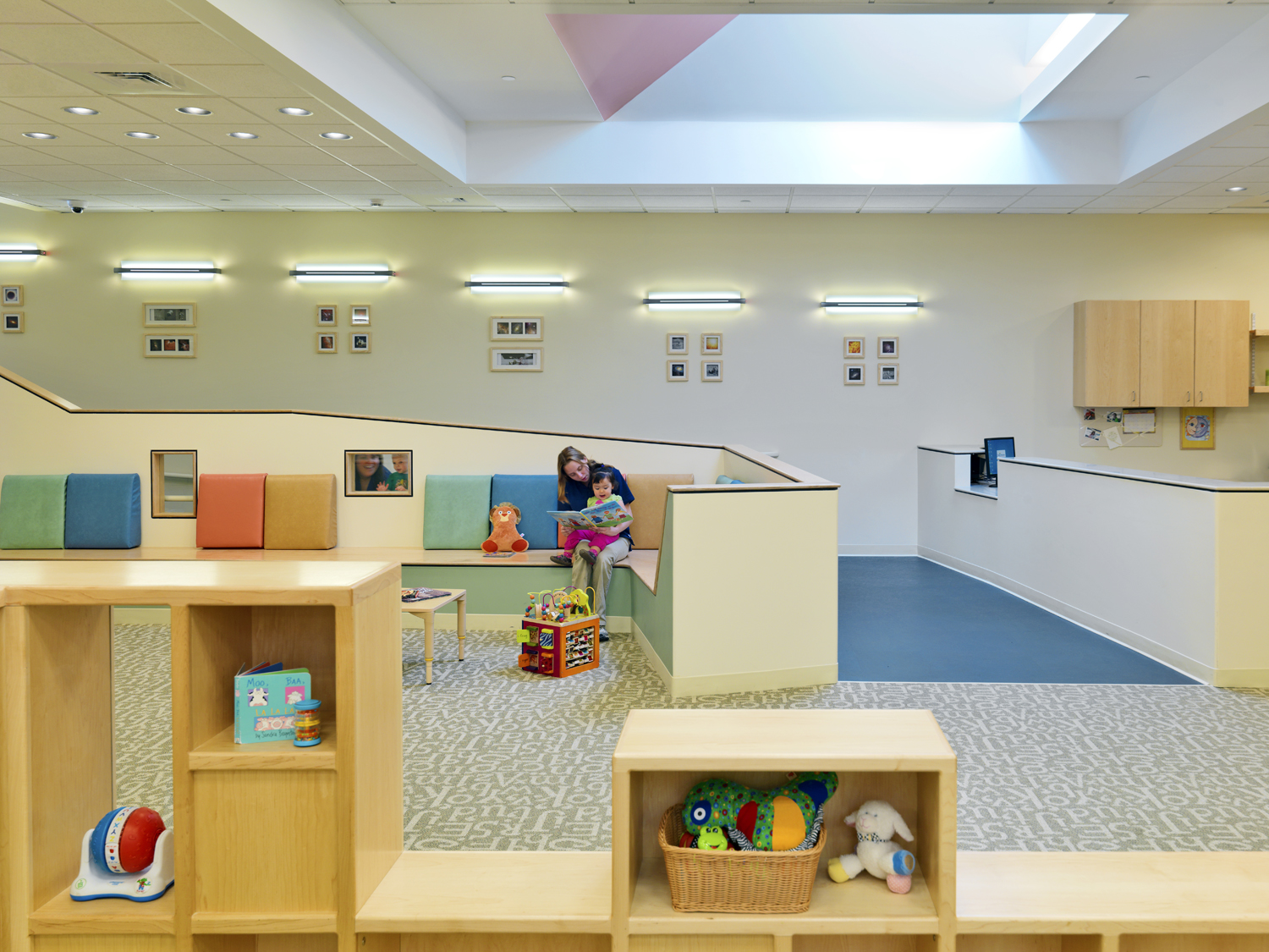
Story time in children's library at Beacon Hill Nursery School 

Story time in children's library at Beacon Hill Nursery School 

"Do you like green eggs and ham?" Sean Gray, an architect at D.W. Arthur Associates, would begin the classic Dr. Suess book to his restless 2 and 4 year olds. As this was likely the 4 millionth time of his reading this particular story and the kids didn't seem to be paying attention, Sean would stealthily skip a few rhyming pages. They could sense the change in the story, or perhaps Sean's slight smile gave him away, and they would shout, "wait wait WAIT! you missed the part about the goat!" The reading of the longest book comprised of just 50 unique words would continue on to its grueling end.

Luckily, the monotony didn't deter Sean from his habit of reading to his children. Based on early education research, the volume of words heard between age 0 to 3 is one of the most important factors in early language development. From a landmark study by a pair of psychologists, a staggering correlation was found between the number of words spoken to the child and the child's verbal ability and success in school.  Up until the age of three, most children's primary conversation partners are adults. The varied language spoken by these adults, likely parents or care takers, help to develop language skills.

The article "Talk to Me, Baby!: Supporting Language Development in the First 3 Years" by Betty Bardige, Ed.D., a developmental psychologist and educator, explores the findings of the landmark study and other subsequent studies. According to Dr. Bardige, "rich language input and responsive, playful relationships during the preverbal and one-word stages build a reservoir of linguistic and conceptual knowledge that fuels the toddler's language explosion." Those who use words well have ongoing advantages. In preschool, they are sought after by their peers for their ability to have play conversations. They are also better able to explain their feelings or their problems, allowing them to talk through conflict. Dr. Bardige also notes that children who enter kindergarten possessing a better understanding of word meanings and sentence construction are better prepared for reading. 

rich language input and responsive, playful relationships during the preverbal and one-word stages build a reservoir of linguistic and conceptual knowledge that fuels the toddler’s language explosion.
— Betty Bardige, Ed.D.

Designing Spaces for Words:

Typically underutilized, spaces like this one in a stair well was designed to include a destination reading nook for the MIT Child Care Center. 

Typically underutilized, spaces like this one in a stair well was designed to include a destination reading nook for the MIT Child Care Center. 

Destination Libraries

One of the simplest ways to create space for verbal development is to include a library within a children's center. Dr. Bardige writes that "book sharing is one of the best ways to enrich talk" with infants, toddlers and young children. Creating a shared children's library gives emphasis to the activity of reading. If space is limited, children's libraries need not be their own distinct room - they can be located in alcoves off of circulation paths or share space with other destination programming, such as gross-motor or art rooms. 

The entrance lobby transition space provided ample area for parents and children to read together at the U. Mass Child Care Center

The entrance lobby transition space provided ample area for parents and children to read together at the U. Mass Child Care Center

Parent/Child Transition Space

Parents are children's main source of communication, so creating a space for parent/child dialogue is important. Reach Out and Read, a nonprofit program based on language and cognitive skills research, creates "literary rich environments" within doctors' offices to encourage families to read together. Child care centers can easily incorporate similar strategies; a parent/child library can be integrated into the drop off or transition space and resource material on the importance of reading together can be offered there. Comfortable seating and a bookshelf could foster new transition rituals with cognitive benefits. 

This large, multipurpose communal space hosts varied conversations among teachers and students at The Children's Center at Harvard Business School 

This large, multipurpose communal space hosts varied conversations among teachers and students at The Children's Center at Harvard Business School 

Communal Space

Spaces that encourage exposure to variations of speech is beneficial to development. Dr. Bardige suggests talking a lot around children; babies need to hear real language (not just baby talk) and toddlers can learn from adults using more advanced words in "context that make their meaning clear." Communal space where multiple classrooms can gather and the teachers are both addressing the children and each other can add to the enrichment of language. The communal space can also host events or lectures from outside of the center, especially if the center is part of a larger institutional or commercial campus. A well-designed gathering space encourages verbal engagement by supporting a range of different types of communication, exposing the nascent students to large volumes and variations of language. 

Perhaps Dr. Suess says it best, 
“The more that you read, the more things you will know. The more that you learn, the more places you'll go.”